Creativity, Design
Designing from nature – the nature of design
Aug
One of my favourite job requests, as a graphic designer, is being asked to create a logo for a business or organisation.
Most logos develop into ‘identities’. They rarely take the form of just a symbol, but are a combination of typography, colours, symbols, styles and other elements.
Developing a logo is one of the most rewarding aspects of my work because the creative process is not predictable.
You can find inspiration at odd times, like when driving the car or reading a book or going for a walk. Sometimes I prefer to take up a pencil or brush instead of the computer mouse.
I recently completed a project that offers a good case study on how the creative process can unfold.
Make it brief
The brief was to design and produce an identity for the newly named Crown Princess Mary Cancer Centre, Westmead.
The brief was developed with my client contact – Jenny Butler, who is the Medical and Network Support Manager for the Sydney West Cancer Network.
There are many people and groups whose needs we had to consider:
 The Danish royalty connections
- Patients
- Medical specialists and other healthcare professionals
- Western Sydney community
- Researchers
- Hospital staff
The brief included a website, publications, stationery and signage.
Sketches, sketches, sketches
There were so many. Some were converted to digital versions and others discarded. All designs were shown to a number of people throughout the Network so there was a range of feedback. (A few of the discarded ideas are below).
A symbol of a flower emerged as the preferred direction for the identity design – in fact, the waratah was mentioned a few times.
I could see the possibility of incorporating the Danish flag with this concept but, to set it apart from other “waratah-like” designs, such as that used in New South Wales Health Department’s logo, I needed to look at alternatives. Below is the first draft using the idea of a waratah.
![]()
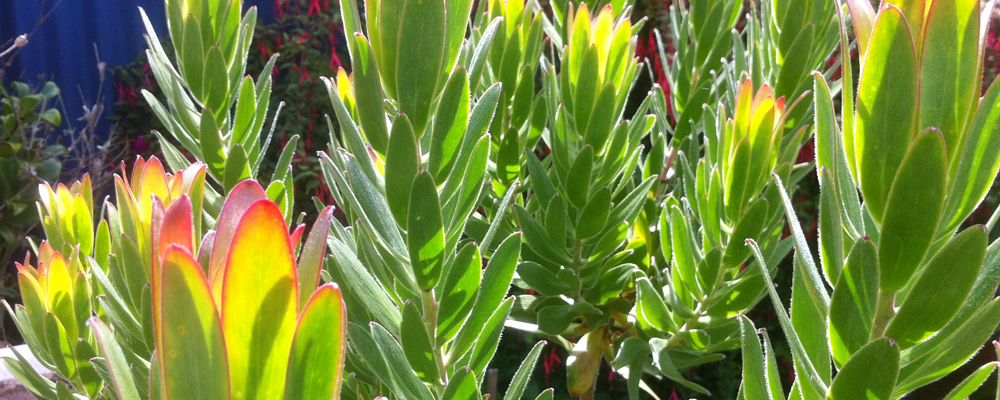
I found a wonderful plant in my garden – the protea. That’s the plant in the photograph at the top of this post.
It was the gradation of colour in this plant that formed the basis of the first prototype of the final logo. Through using a paintbrush instead of my computer mouse, I essentially came up with a ‘new’ flower that used the colours in the protea, the rough form of the waratah and incorporated the Danish flag.
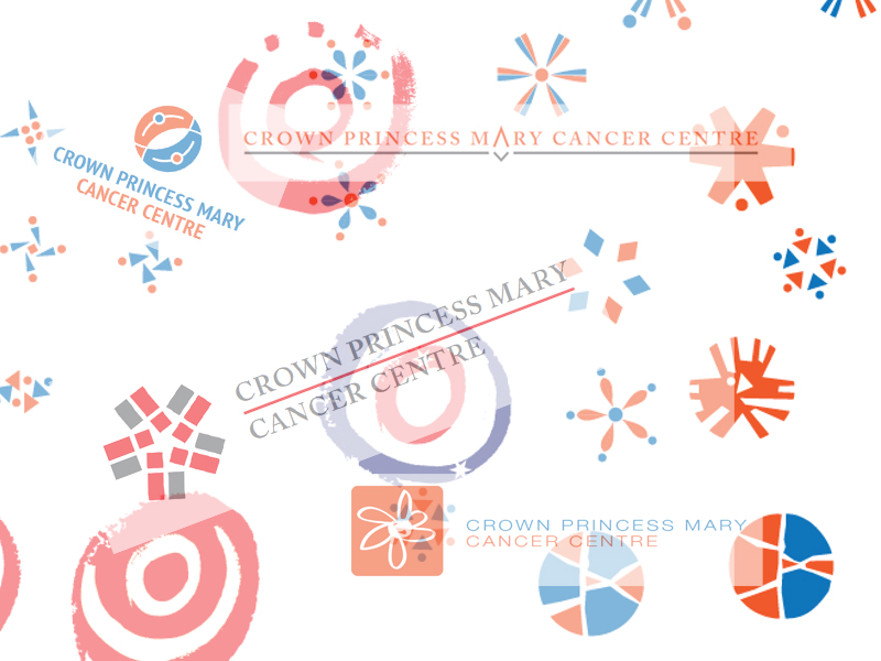
The logo and its tri-colour scheme were well received. We also developed a new website for the Centre and developed alternative logo versions, business cards and stationery templates.
Below are the final versions of the logo.
![]()
![]()
A natural approach
You may be seeking inspiration for a design or anything creative and have spent hours or days trying out ideas on your screen.
Sometimes it’s great to get outside and take a look around at the colours and shapes that nature has on display. You may be delighted in what you find.
It would be interesting to find out how often this approach to design – designing from nature – has produced your best work or at least given you good ideas to develop further.
Another thing I take from this experience is that design is rarely a solo effort. Developing the identity of the Crown Princess Mary Cancer Centre was truly a group effort, and I was fortunate to be working with such dedicated and experienced people as Jenny Butler and the Centre’s Director, Professor Paul Harnett.
Thanks for reading.
cheers
Mitchell
Well written overview of the whole creative process involved with the development of a logo/branding Mitchell.
It was both a rewarding and challenging project. At times it felt like we were never going to get there as it seemed such a huge undertaking. Just when we thought it was all too hard with so many choices with regards to decisions about colour schemes, symbolism choices etc, progress was made through, firstly wide consultation and then a key focus group made the final decision.
One lesson learned from this whole exercise is to be patient and let the creative process happen naturally – you will get there and when you do get there, believe me, you WILL KNOW! It is like hitting the sweet spot on a tennis racket or snapping that perfect imagine on your camera. It is a good feeling!
Our new logo / branding has been well received by both staff, patients and our community.
Thanks for the comment, Jenny.
It’s great to get a good result and was well worth the effort.
cheers
Mitchell